Zomato
.
Designing for India's largest
food delivery system
Designing an AI-powered conversational interface that streamlines decision-making for complex, mood-based food queries.
2023
Opportunity Area
Nobody wakes up craving "cuisine: Indian, price range: mid, rating: 4+." They think "it's raining, I want something warm" — and then the app makes them turn that into tags before it'll do anything useful. Somewhere between the feeling and the filter, a lot of people just close the app.
What if that translation step didn't need to happen? What if you could type the feeling itself, and the app just worked with it?
Introducing Zobu
Zomato's search is good at answering questions you already know how to ask: cuisine, distance, price. It's less good at "something light, it's hot out" or "I want to feel better, order me comfort food." Those aren't searches. They're moods, and moods don't have filters.
Zobu is a conversational assistant built for exactly that gap. You say what you're feeling like, and it works from there instead of asking you to translate it into tags first.
What we did
Ordering inside the chat sounded exciting early on, but it kept bloating the scope, so we cut it.
The version we shipped only handles helping someone decide what to eat.
Scoped to discovery - dropped in-chat ordering to keep the MVP focused.
Competitive analysis - looked at ChatGPT, Bard, Snapchat AI, Bing, and Replika to see how they handle tone, guided prompts, and multimodal output.
Iterated entry points and onboarding - where the assistant sits in the app, and what the first screen looks like. We tested it inside "What's New," a home banner, a floating action button, and an Explore tab. We also tested a separate preferences screen and a dark theme, then dropped both, each added a step before someone could actually start typing.
Iterated item and dish cards - tried large-image layouts, dark cards, horizontal carousels, and grid views.
What we shipped
Search-based entry point- Zobu sits inside the search screen.
Restaurant-grouped list cards - dishes grouped under their restaurant header, in a vertical list. Uses more vertical space than the alternatives, but handled variable item counts and long dish names without breaking.
Contextual prompts - fading prompt suggestions in the chat input and intro screen, there to guide input without locking users into fixed phrases.
Light theme, Zobu as the mascot - matches Zomato's existing visual system.
Entry Points Iterations

"What's New" rail: first choice for the entry point, later dropped from the home page entirely once it proved not durable enough.

Search bar placement: easy to find, but collided with where the mic icon already lived

Home page banner: introduced Z Butler well, but took up too much space to justify a permanent spot.
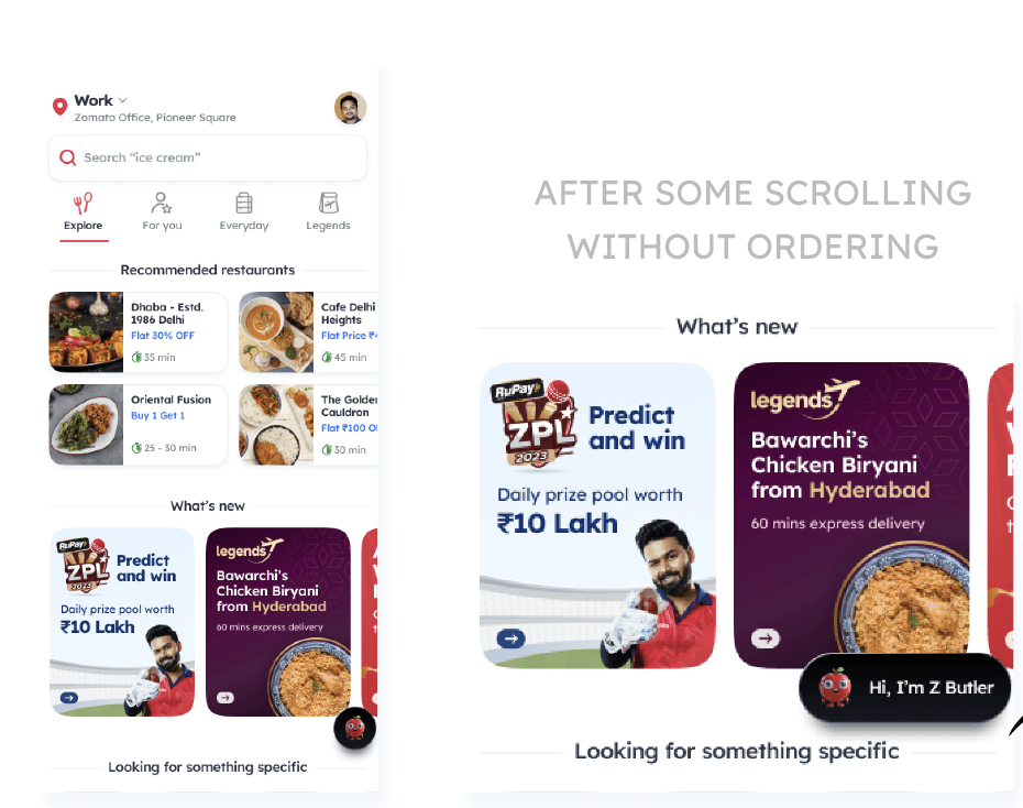
Floating Action Button: could expand into a greeting after inactivity, but risked doubling up on pages that already had a FAB.

More Categories button: considered as a home for Zobu, but risked burying it too deep for anyone actually looking for help.
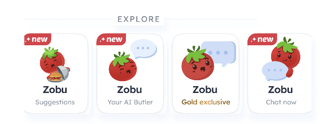
Explore cards: tested Zobu there so the feature would be instantly understood at a glance.
Final Entry-point
Zobu release- Entry point
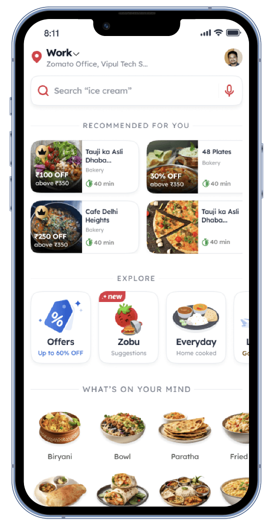
Soft-launched in the Explore section first, using a teaser banner that hinted at the feature without fully revealing it, to gather feedback before a wider rollout.
Final Entry Point

The final Entry point sits in the Search Bar, ensuring easy user access.
Introductry screen Iterations
The onboarding preferences screen added a step without adding much. Reading order history and asking follow-up questions inline, inside the chat, covered the same ground.

Balancing a clear explanation of what Zomato Butler does against a design that still felt warm rather than instructional took several rounds of layout and colour exploration.

Considered a dedicated screen asking for name and dietary preference, but since order history already implied preferences and a missing name could just be asked in-chat, the standalone screen was cut from the final version.
Final Introductory Screen
Education Screen: Shown for a user's first 2–3 visits, before they open the chat, just enough to explain what Zomato Butler does.
Item Card Design Iterations
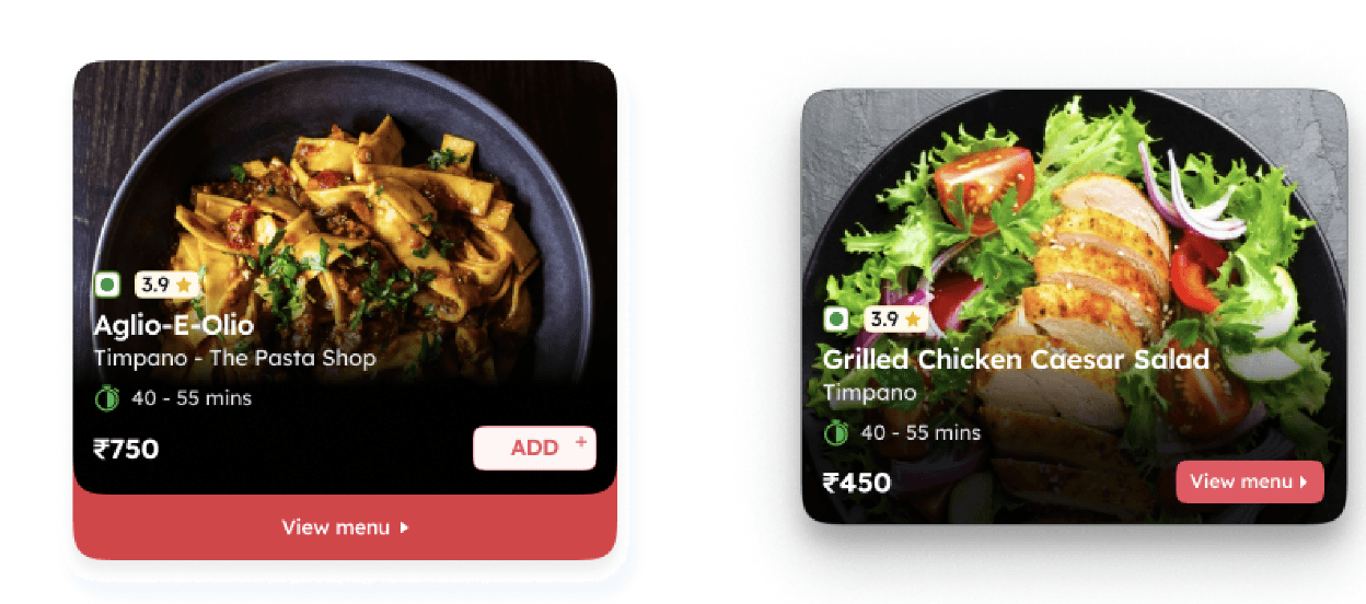
Large-image cards showcased the dish well but ate up so much screen space that scrolling became a chore.

Horizontal scroll made it worse: dish names and offer badges varied in length, so card widths stopped lining up and the row looked inconsistent.

The list view fixed the earlier layout problems, but introduced a new one: the restaurant name repeated every time two or more of its dishes appeared in a row.
Fixed by grouping dishes under one shared restaurant header instead of repeating it per item.

Horizontal card scroll: matched the search-results style, but broke visually the moment only one item was returned.
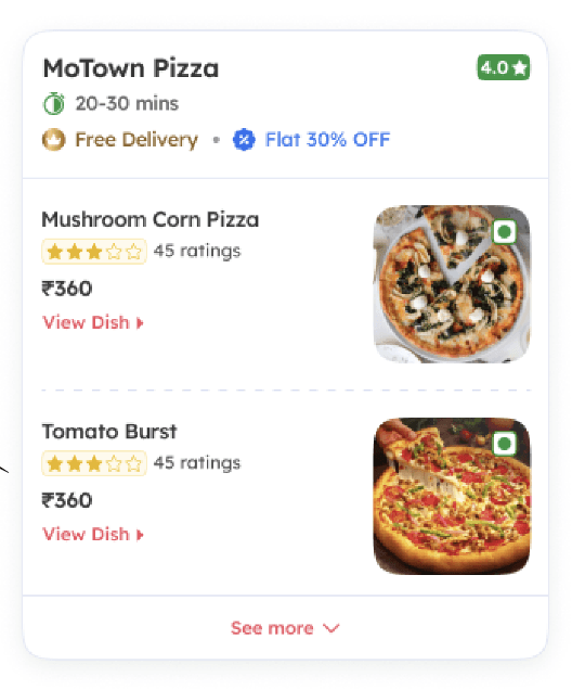
List view was chosen deliberately for consistency, even though it costs more vertical space than the alternatives.
Final Card Screens

Item Card

Restaurant Card
Designing Micro-interactions
Problem: Delivery delays caused by weather showed up as silence or a stalled tracker, leaving users anxious and more likely to contact support or cancel.
Solution: A gentle, reassuring message on the tracking screen that explains the weather-related delay when it happens, instead of leaving the delay unexplained.
Business impact: Fewer support tickets during weather disruptions, and less order cancellation from anxious waiting.
Problem: Offers were visible on the menu but conversion from seeing an offer to adding it to cart was low, visibility wasn't translating into action.
Solution
Added clear progress cues and micro-interactions at the point of decision, so a user could see how close they were to unlocking a deal rather than discovering it after the fact.
Business impact
Higher menu-to-cart (M2C) conversion.
.say hello